How can cultural identity help in planning more inclusive cities?

CoFutures believes that urban planning should be accessible and easy to understand for everyone. Their YouTube channel breaks down complex city planning concepts into simple, educative, engaging videos.
They wanted to create an explainer video that would inspire their audience to consider how they can draw on their own cultural experiences and influences to create more inclusive cities for everyone. They had a script but approached me to develop the video's look and feel and animate it.
CLIENT
CoFutures
YEAR
2022
ROLES
Art direction
Illustration
Motion

Concept 1 draft illustrations
I presented them with two concepts to show them how we could use different visual approaches to bring their message to life:
Concept 1 was quite literal, borrowing a lot of symbolism from the language of urban planning, such as maps, speech bubbles and surveys. The characters were easily distinguishable, to the point where we could make assumptions about their gender, age, and ethnic background.

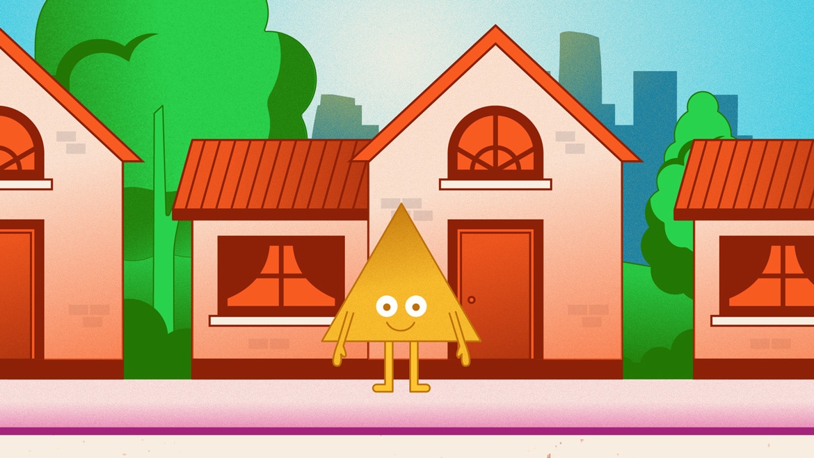
Concept 2 storyboard
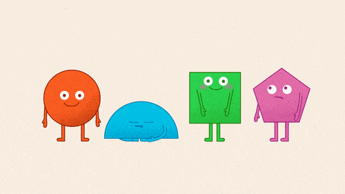
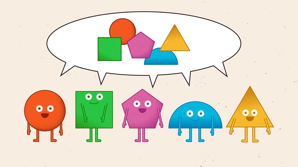
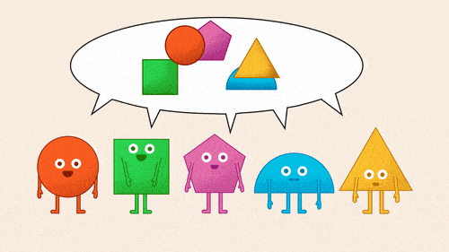
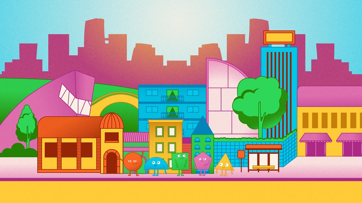
Concept 2 was more metaphorical, with a greater focus on the characters. They were made of shapes and colours, which they would use to build their city together. This concept is the one that CoFutures chose to move forward with.

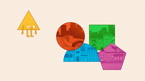
Initial characters design
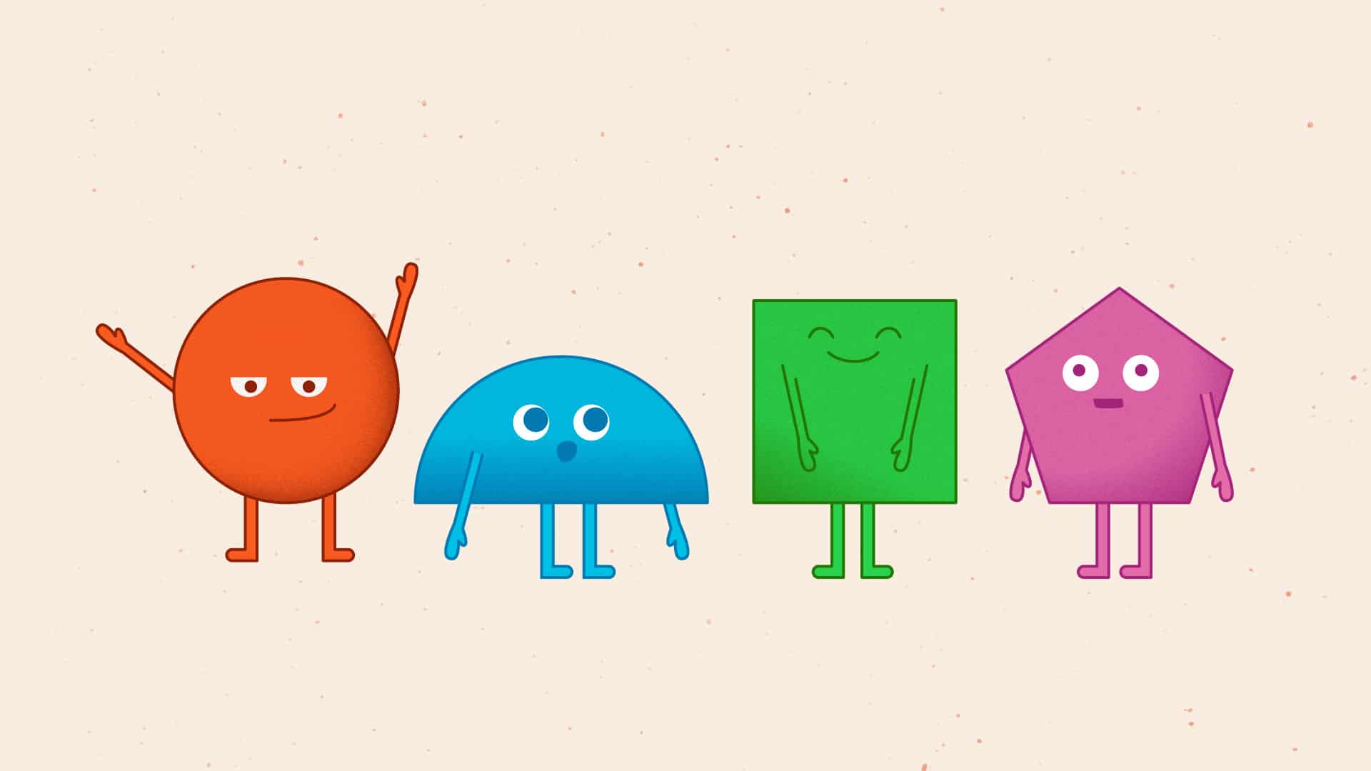
Final characters design
The design of the characters evolved over time. Initially, we gave them an anthropomorphic form with different head shapes and used the CoFutures branding colours as the palette for the illustrations. However, we decided to broaden the palette and associate a single colour with each character. We also simplified their design by using their shape as their entire body with a few human features.